Colours
First a disclaimer. I’ve had no formal training in art, so whatever I say here is just my opinion, based on experience, trial and error, and what I’ve gleaned from books or online over the years.
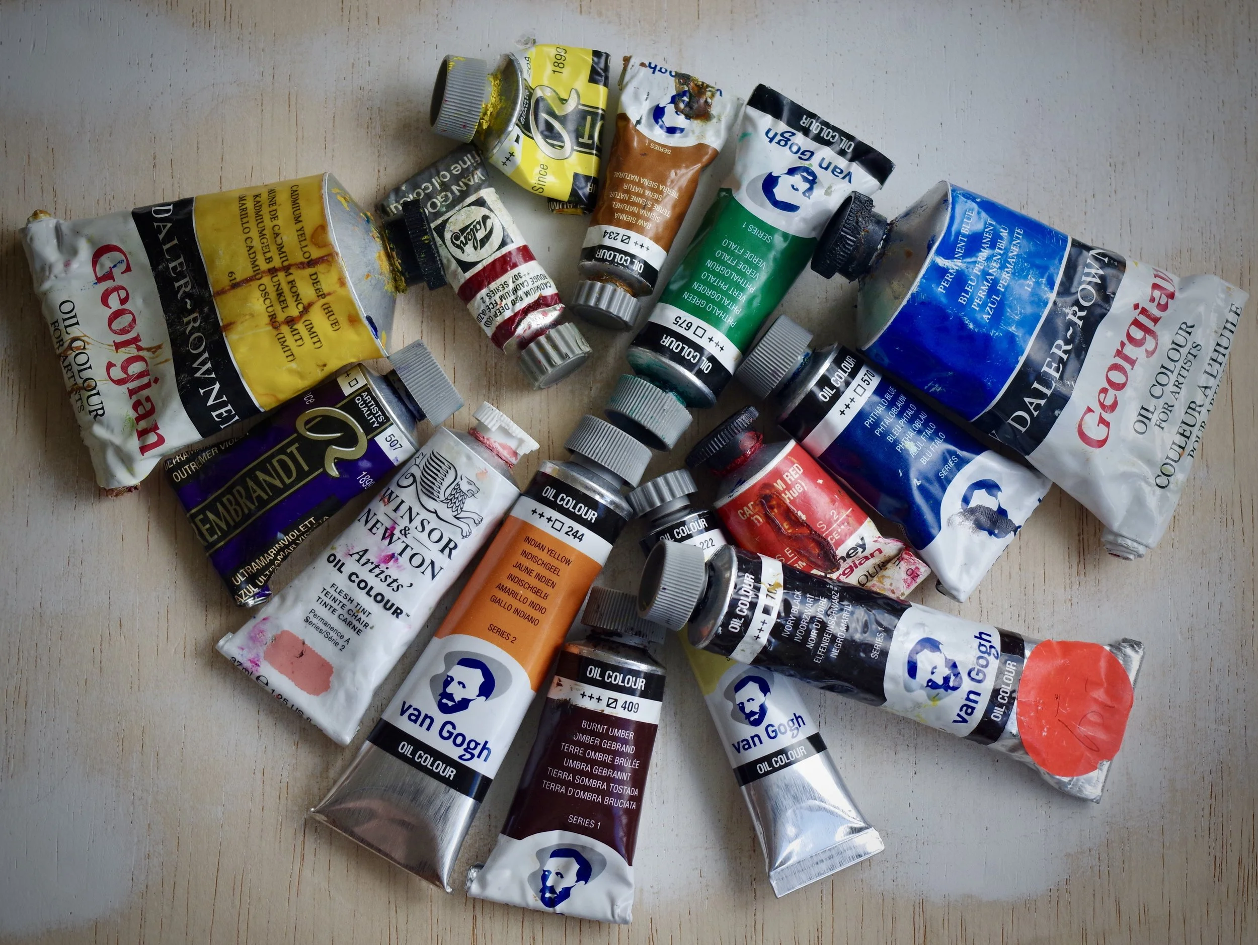
When I started oil painting several people gave me tubes of paint. Paints being expensive and I being not particularly rich, I accepted them. I have also occasionally visited my local art shop to plunder the bargain bin for whatever happened to be reduced at the time.
These are haphazard ways of assembling a comprehensive collection of colours, and I don’t recommend them. Far better to figure out what are the small number of essential colours to have on your palette from which all other colours can be mixed, begin with these and later add colours that you find particularly interesting or useful as shortcuts.
What then are these essential colours? As children we learn that there are three primary colours - red, blue and yellow - and that these, sometimes lightened with white, can be used to mix any colour. In practice things aren’t so simple, given the huge variety of reds, blues and yellows available. Purples and violets are particularly difficult colours to mix. Try mixing pthalo blue with cadmium red, for example. I challenge you to come up with anything other than a dirty brown.
Colours are said to be either warm or cool. The warmest colours are those from the red/orange part of the spectrum, while the coolest are those from the green/blue part. Very few primary colours are completely neutral; most tend to lean in the direction of either warm or cool. So a blue that tends towards red/violet is said to be warm, while one that tends towards green is said to be cool. Likewise a red that tends towards orange is said to be warm, while one that tends towards purple is said to be cool.
A ‘split primary’ palette is one that would include warm and cool versions of each of the three primaries. My own favoured palette would include: ultramarine blue (warm) and pthalo blue (cool), cadmium red light (warm) and permanent alizarin crimson (cool), and cadmium yellow light. Only one yellow? Most advocates of a split primary palette would suggest something like lemon yellow (cool) and cadmium yellow medium (warm), but I find cad yellow light to be very neutral and fine for mixing both greens and oranges, so that’s where I’d economise.
As well as these primaries a large tube of white would be essential (titanium white for me because of its opaqueness and covering power) and also at least one brown earth colour, which for me would be burnt umber - very useful for mixing skin tones and also blacks when mixed with ultramarine blue. No need for any tubes of orange, green, purple or black to begin with if you’re on a budget; these seven colours shouldn’t break the bank.
Do I have a favourite brand? All of the established brands are good to my mind. Most large manufacturers produce at least two grades of paint: student and artist grades. Student paints are cheaper and have a higher proportion of ‘filler’ mixed in with them; artist paints have a higher proportion of pigment, so have greater covering and mixing strength. Go for artist grade paints if you can afford them; they really are appreciably better in most cases. There are other materials and tools that will give you scope to economise, and I hope to cover these in future posts, but do get the best paints that you can. But if artist grade paints are beyond your budget don’t worry. The animated film ‘Loving Vincent’ (which you really should see) was made using Van Gogh paints, the student grade paints produced by Royal Talens here in the Netherlands. And yes, I do have a favourite brand, but not for the reason you might think. Royal Talens is based in my home town, and I buy their paints, Van Gogh (student grade) when I’m feeling poor and Rembrandt (artist grade) when I’m feeling rich, because I like to support local businesses and keep my paint miles to a minimum.
